
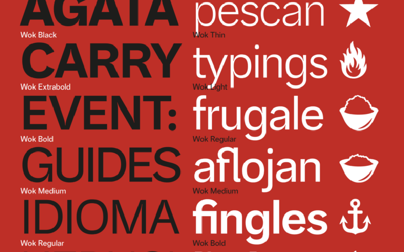
Wok Sans: A restaurant’s own voice, developed through teaching and collaboration
Wok Sans began in a type design classroom at Universidad Nacional de Colombia. César Puertas and his students Camilo Almeciga, Sebastián Ramírez, Margarita Sánchez and Johan García explored a custom typeface for Wok, working with the creative direction of LIP. The project brought the questions of a university course into contact with the everyday needs of a restaurant brand.
A familiar starting point
Wok had used Akzidenz-Grotesk for more than two decades. Its familiarity provided a starting point for developing letters with a character specific to the restaurant. The students began by drawing on paper, then digitised their work to produce an initial set of lowercase letters, capitals and numerals.
By the end of the course, that work had become a prototype. The project continued beyond the classroom, through a period of technical development complicated by the pandemic, until the initial drawings could function as a complete family.
Letters, symbols and everyday use
The drawing combines a high x-height, compact proportions and a single-storey g. These details give the familiar grotesque structure a character of its own, particularly visible when the letters are set large.
The resulting seven-weight family gives Wok a typographic vocabulary for organising information. Menus bring together dish names, descriptions, prices and supporting details, making the relationship between different levels of text especially important. A shared family lets those levels feel connected while providing changes in emphasis.
Wok Sans also incorporates the brand’s pictograms, including its symbol for responsible fishing. These signs belong to the restaurant’s way of communicating its practices and commitments. Their presence alongside the alphabet brings words and familiar visual cues into the same working resource.
From classroom to commission
The project retains a direct connection to its educational origins. Students participated in the drawing and development of a typeface that would enter the world as part of an established brand. Wok Sans gives that collaboration a lasting presence in the restaurant’s visual identity.
Custom typeface created exclusively for Wok. Not available for retail licensing.
